Brand Guidelines
Our Brand Guidelines PDF includes more detailed info about our photography and graphic devices, including image examples and guides for shape corners, angles, and gaps.

People. Place.
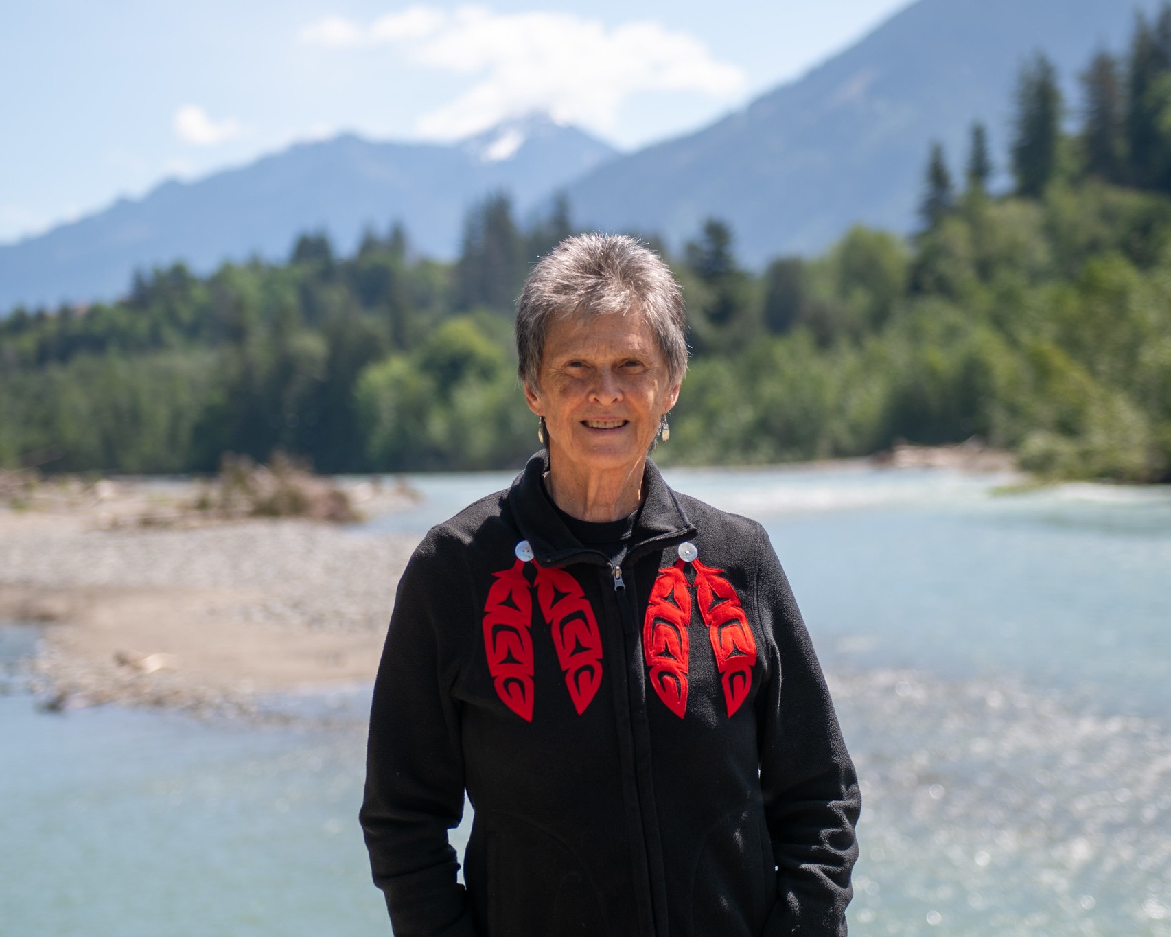
Photography plays a central role in expressing who we are. Grounded in people and place, our imagery reflects our home on Stó:lō Téméxw and honours the territory that sustains us. It speaks to our deep connection to the land, while also reflecting our commitment to students, faculty, staff, supporters, and the broader community that shapes UFV.
To guide image selection and creation, we’ve organized photography into two core themes — people and place. Together, these themes help ensure our imagery feels authentic to the UFV brand: warm, grounded, transformational, and connected.
A complementary studio style further supports the creation of people-forward photography that feels intentional and cohesive.
We champion human moments and interaction, showing the strength of relationships at UFV. Our people are driven, active, and ambitious- — engaging with their work and one another. We’re not afraid to show the lighter, friendlier side of our personality.
Style checklist
Our photography also conveys a strong sense of place on campus, in the city, and in the awe-inspiring natural surroundings of the Fraser Valley (Stó:lō Téméxw). People are featured interacting and working in these grounding places.
Style checklist
When a studio shoot is possible and appropriate, it offers an opportunity to bring the UFV brand into the environment through backdrops, wardrobe, and other considered touches of colour.
Encourage people to express themselves authentically and show different sides of their personality.
Aim for images that feel spirited, inquisitive, and empowering, capturing the individuality and warmth of the UFV community.
Style checklist




Keep these considerations in mind when selecting, cropping, and working with photography and other imagery to ensure a consistent and authentic UFV brand.
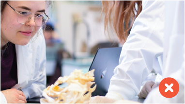
Crop with care. Don’t crop out important parts of an image, and be mindful when cropping people and bodies.
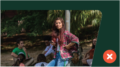
Maintain contrast. When placing images in branded shapes, ensure there is enough contrast between the image and its background so the shape remains distinct.
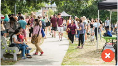
Keep the focus clear. Avoid images that are overly busy or lack a clear focal point.

Avoid AI-generated imagery. Don’t use images with artificial-looking people, environments, or details. When using generative tools to expand or adapt original photography, review the results carefully for inaccuracies or AI-generated artifacts.

Be discerning with stock photography. Don’t use inauthentic images or locations that are clearly not our campuses or communities. When original photography isn’t available, choose quality stock that captures natural expressions, interactions, and moments.

Avoid photo-illustration. Don’t use heavily composited, manipulated, or conceptual imagery that blurs the line between photography and illustration. Original illustration and artwork may be used when showcasing UFV artists, but are not part of our core brand expression.
Our graphic device shapes are inspired by diverse pathways and natural organic shapes found in the structure of leaves.
They are purposely abstract so that they may be used in any context for ultimate flexibility.
Our shapes can be adapted in width and height, offering variety when working in layouts.
Shapes angles should be limited to one side in most cases. The angle is flexible and is meant to adapt to custom content.
Shapes may be filled with colour, copy or images (used as containers as well as have elements popping out in some cases).
A note on copy within shapes:
Generally left-align copy blocks in shapes. Hang text from top left corner of shape or center vertically as needed. The angle of the shape can be adapted

Holding photography. Use shapes to frame photography. Adapt the angled edge to complement the image and composition.
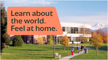
Holding copy. Use shapes to hold copy, add emphasis, and introduce a pop of colour over photography or within a layout.

Overlapping shapes. Overlap shapes to create space for supporting content such as captions, labels, or pull quotes.

Content containers. Use large shapes to hold content and create bold areas of brand colour.
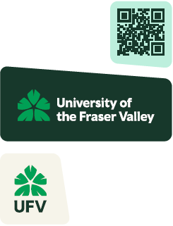
Logos and QR codes. Use shapes to hold logos, QR codes, and other small brand elements.

Bleeding off the edge. Extend shapes beyond the edge of a layout to create movement and allow photography or other elements to break the frame.
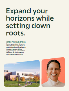
Using multiple shapes. Combine multiple shapes within a layout, keeping angles consistent to create cohesion.
Shape usage is flexible. Shapes can:
Multiple shapes can be used within a layout. When using more than one shape, maintain consistent visual relationships between them, such as a shared angle.
Using the shapes is optional. When in doubt, use a plain rounded rectangle or keep your composition clean and simple.
Here are some additional tips on working with our shapes.
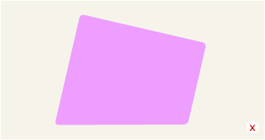
Don’t rotate shapes at intervals other than 90º. Keep to one angled side in most cases.

Don’t make the corner radii too small (left) and pointed or too large (right) and rounded.
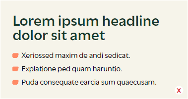
Don’t make the shapes too small. They should never be used as icons or bullets.
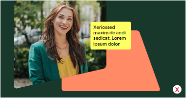
Don’t overlap too many shapes together — one overlap max. If using a complex shape, pair it with a simpler one.

With photography that incorporates our secondary colours, don’t incorporate an additional secondary bright colour.

Don’t overlap copy with shapes. Keep it completely inside or outside the shape.
Our Brand Guidelines PDF includes more detailed info about our photography and graphic devices, including image examples and guides for shape corners, angles, and gaps.